Harmony was imagined as a green tea brand for those seeking peace in their everyday lives. Inspired by the quiet beauty of early morning tea fields and the grounding nature of a warm cup of green tea, the brand was designed to feel like a gentle pause — a breath of stillness in a fast-paced world. Every element was shaped to evoke softness, clarity, and understated elegance.
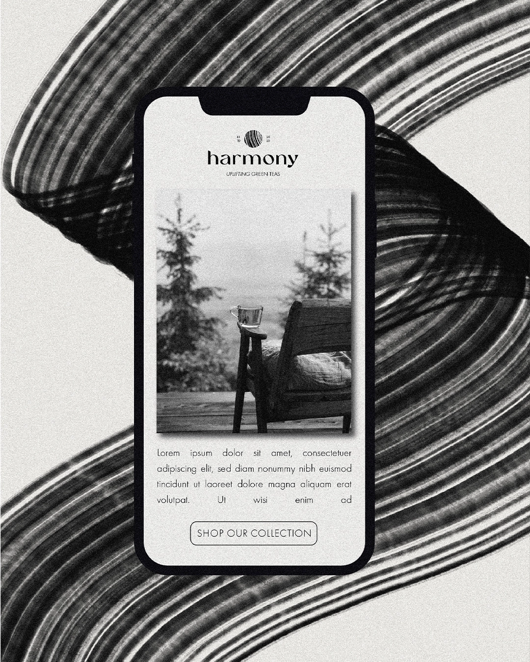
The goal of this project was to create a calming, minimalist brand identity rooted in serenity and balance. The visual direction needed to feel both premium and approachable, reflecting the soothing experience of tea drinking. The color palette was intentionally kept neutral — black and off-beige — to communicate simplicity and purity. Inspired by nature and refined by design, Harmony invites its audience into a world where less is more, and every sip feels like a return to stillness.
What the brand got
Brand strategy
Tagline
Visual identity
Packaging
Ready to bring your brand to life?
Let’s shape a brand that captures not just what you do, but who you are.