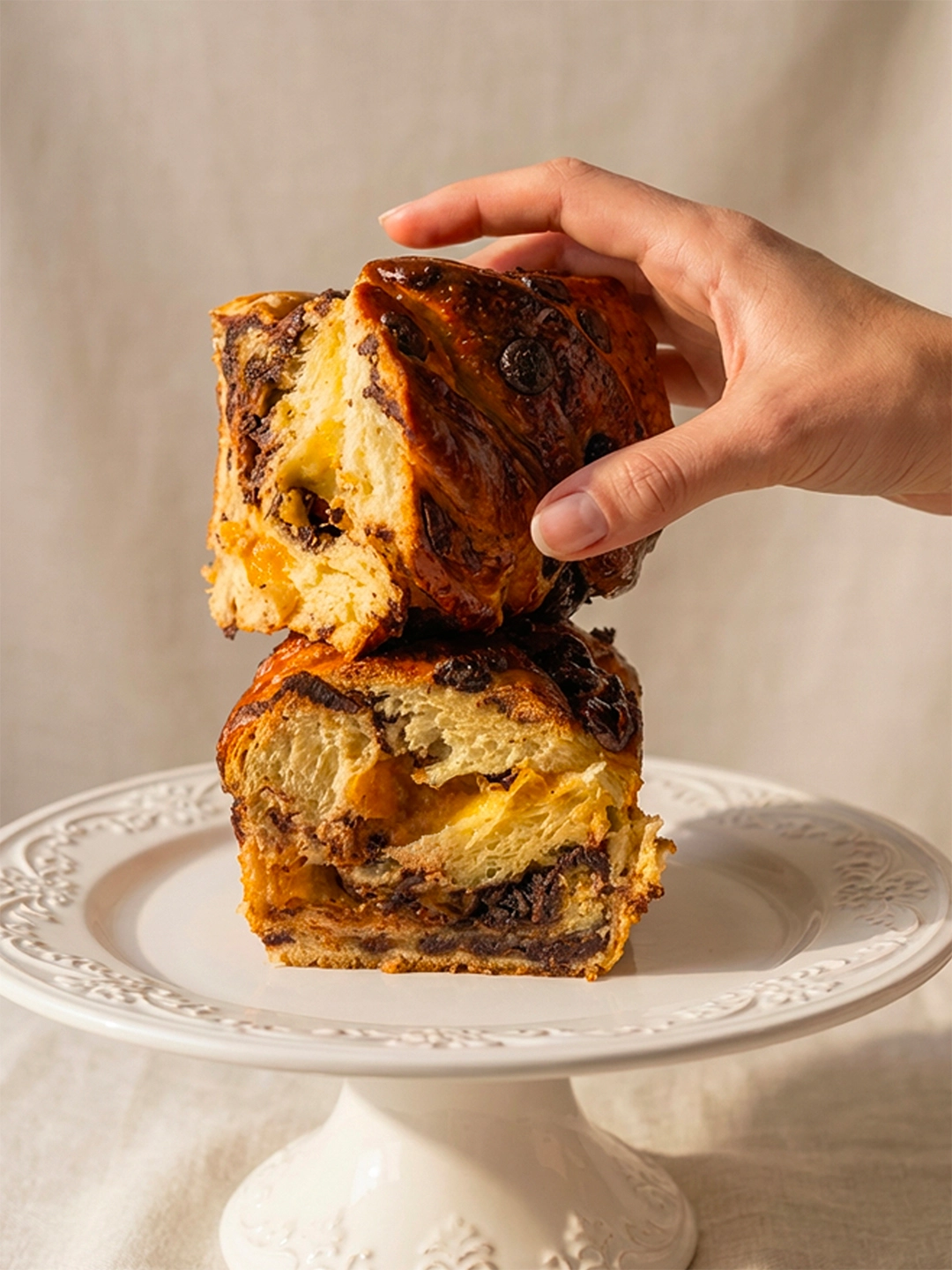
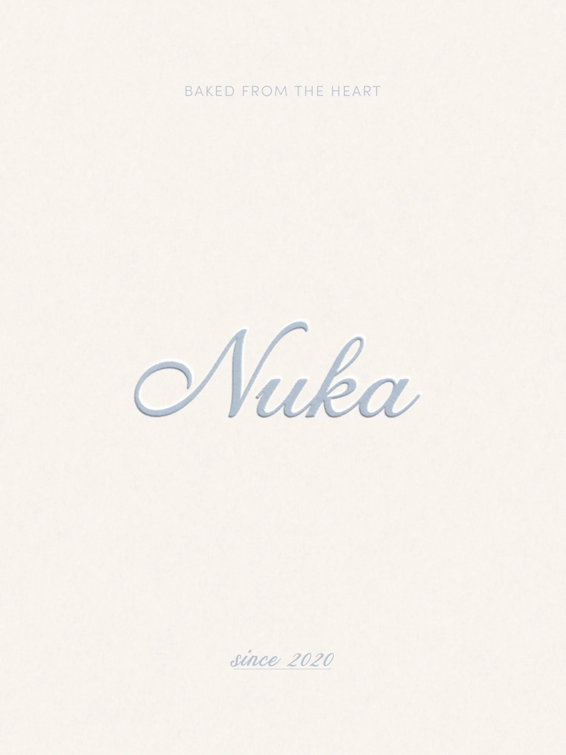
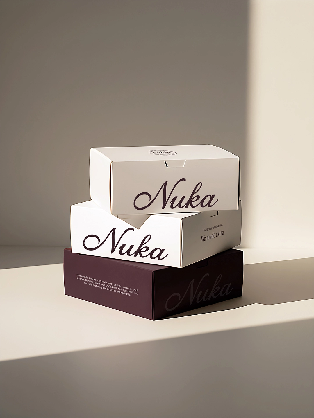
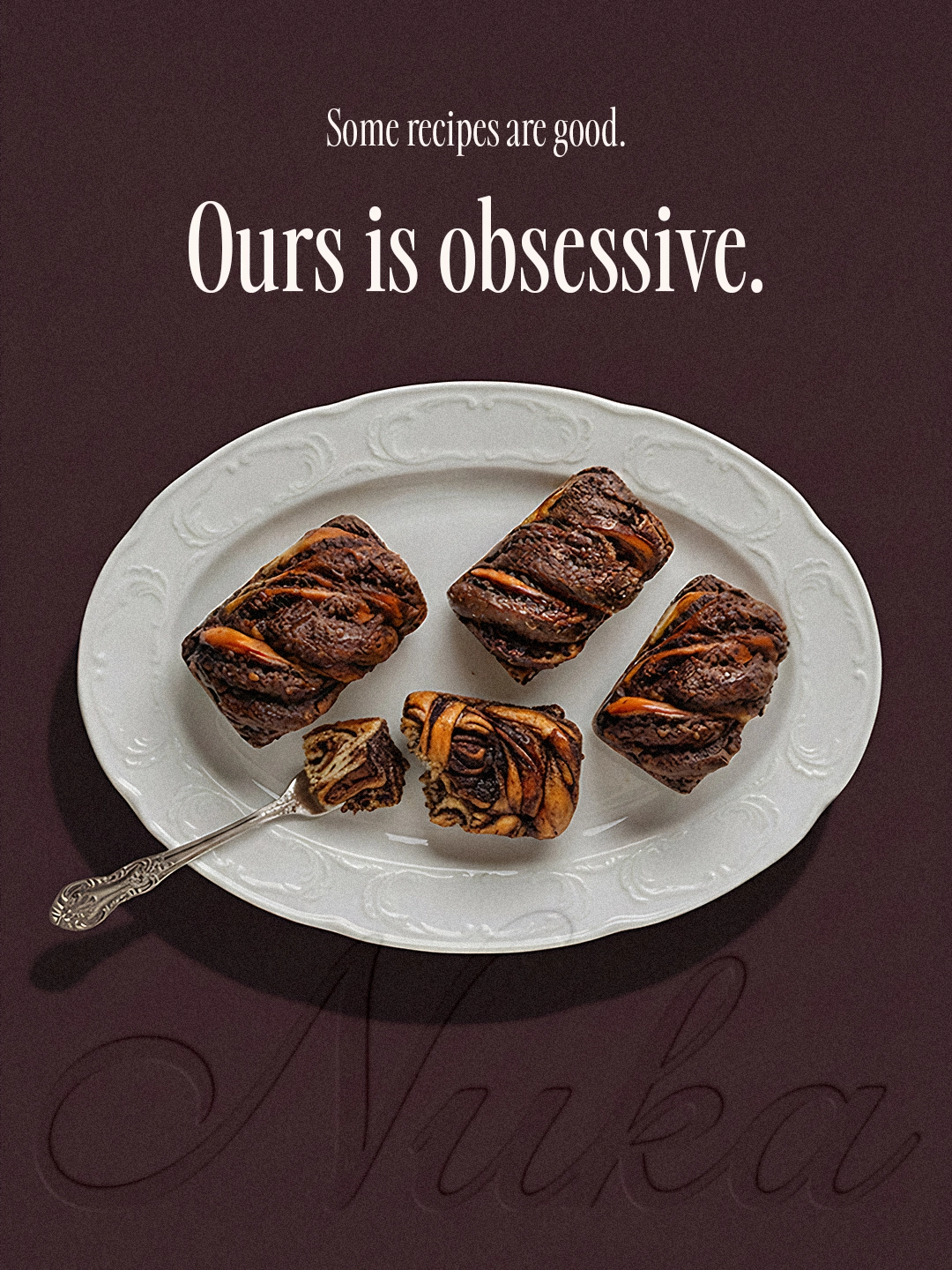
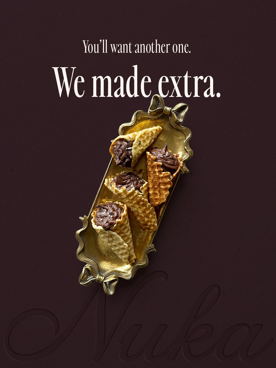
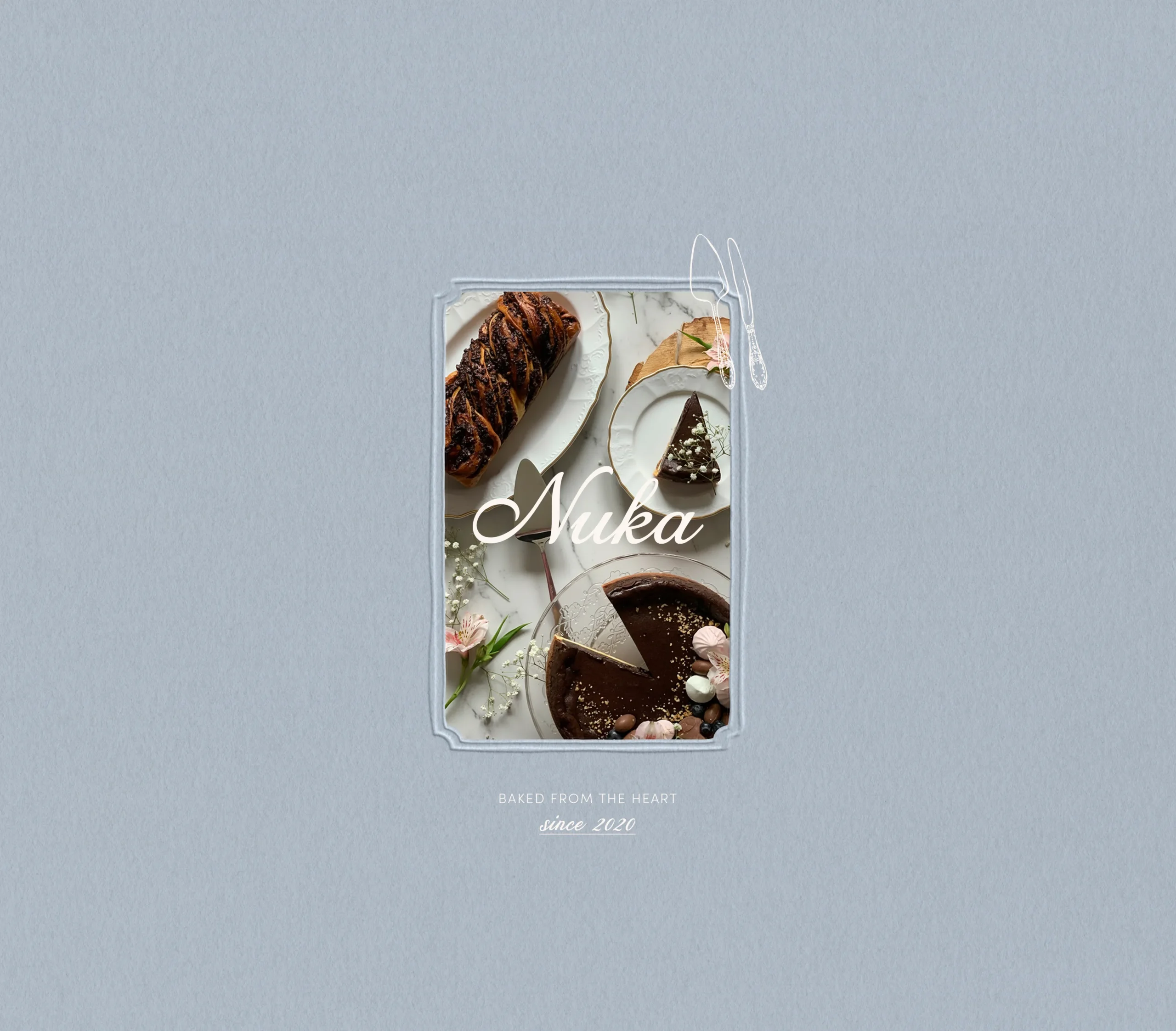
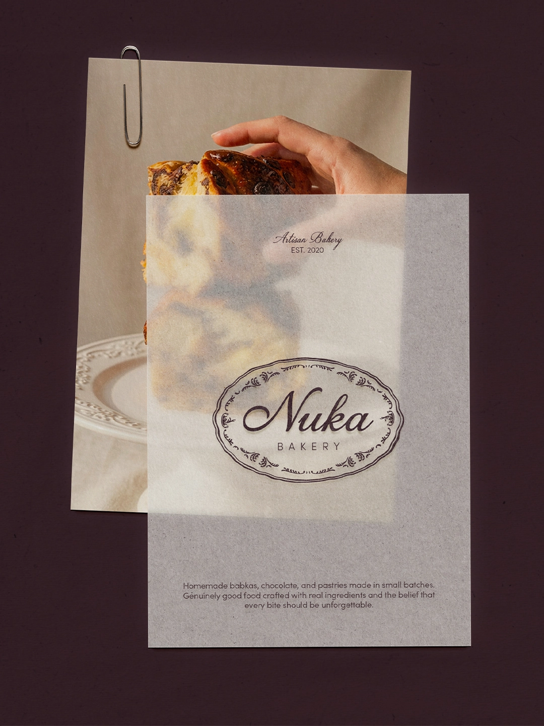
What began as a mother’s homemade chocolate became a business built on the belief that quality is never negotiable and that people deserve to eat something truly made with care. Today Nuka produces artisan babkas, homemade chocolate and handcrafted pastries, with a growing presence in cafe partnerships across the city.
Project objectives
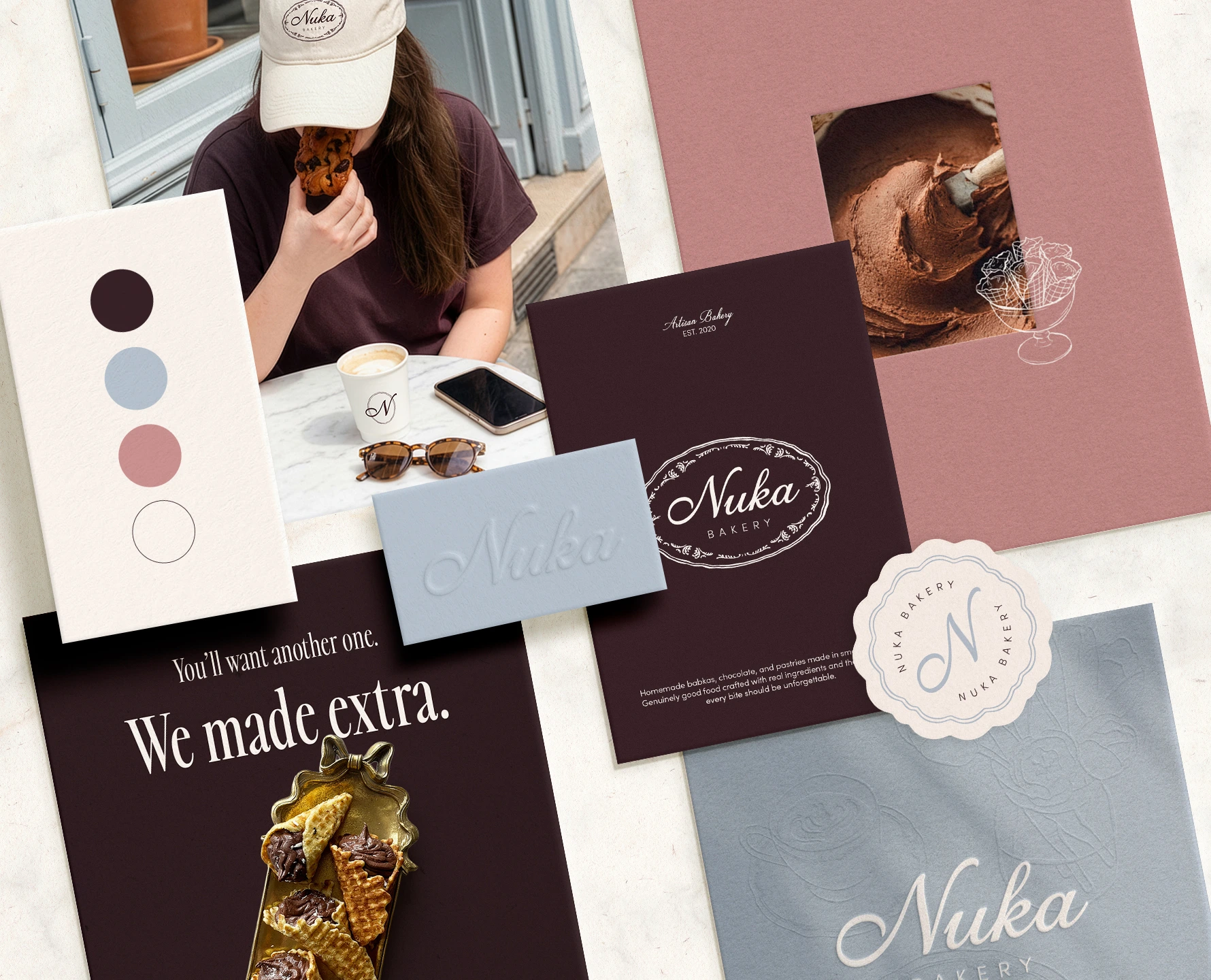
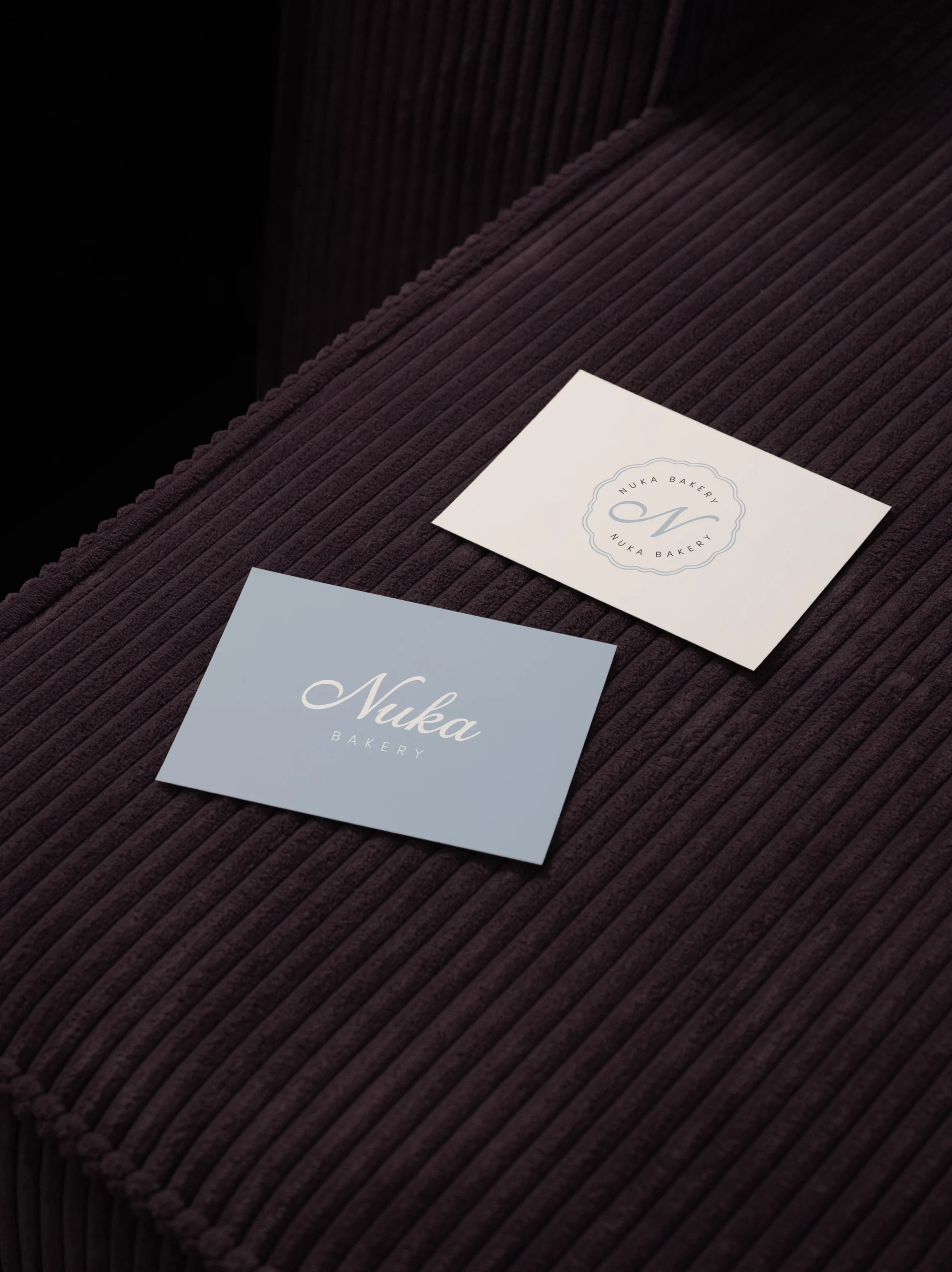
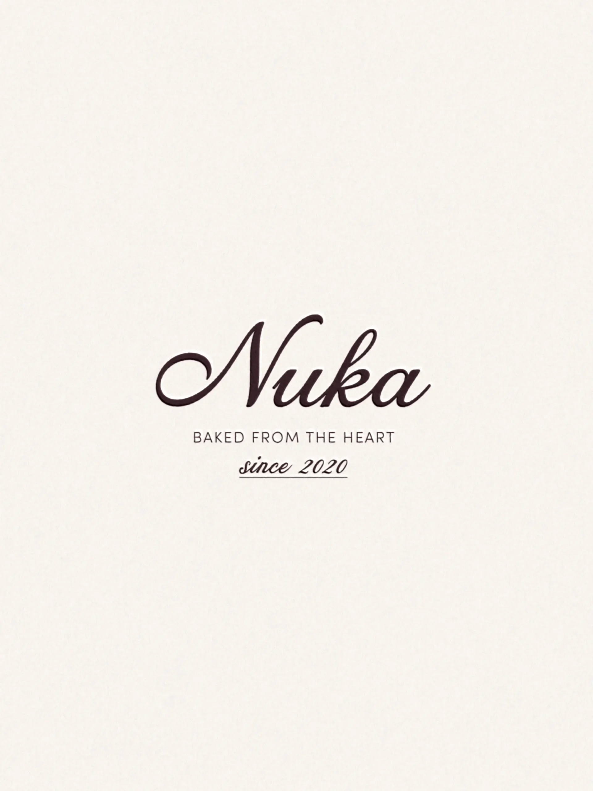
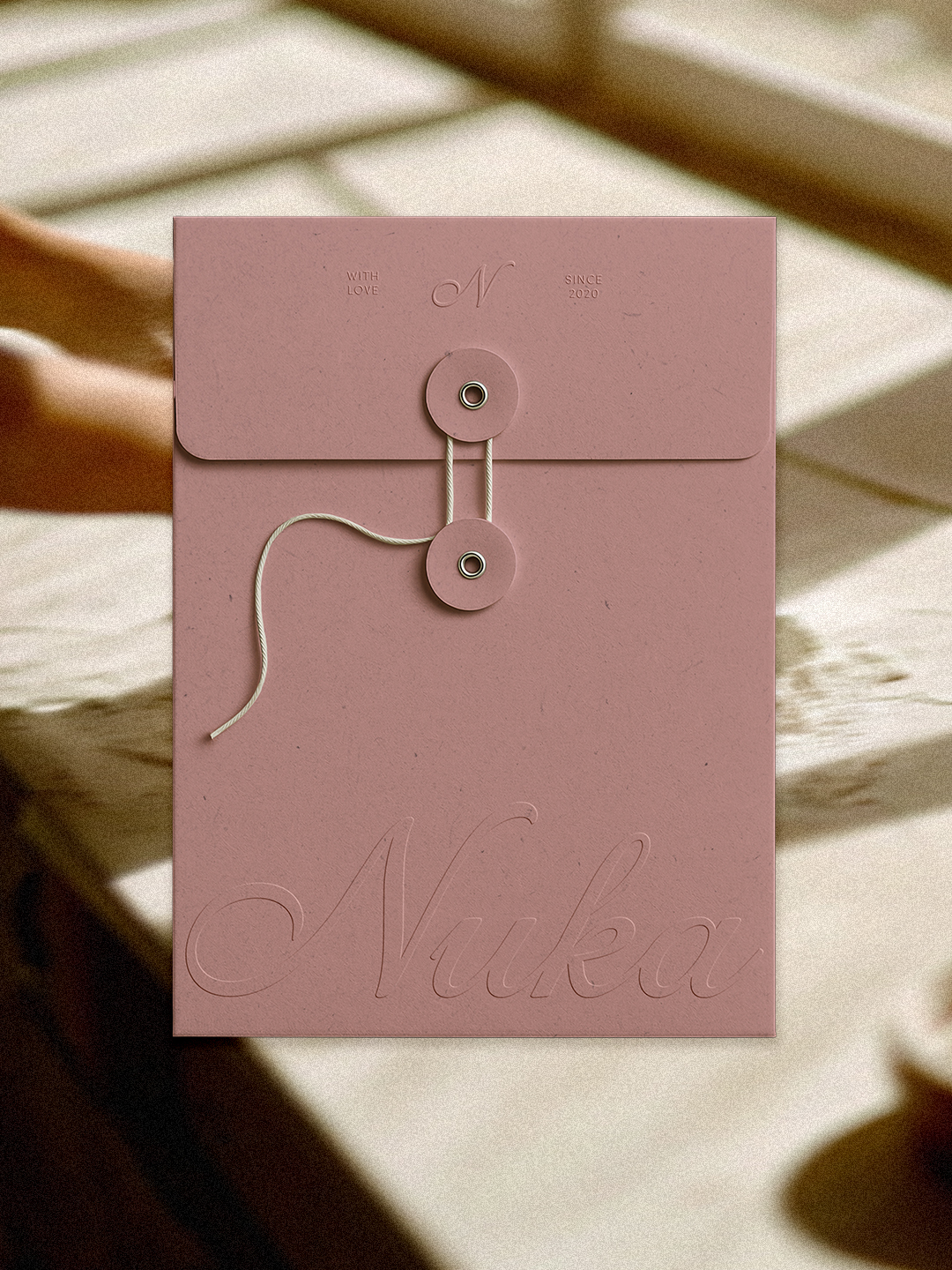
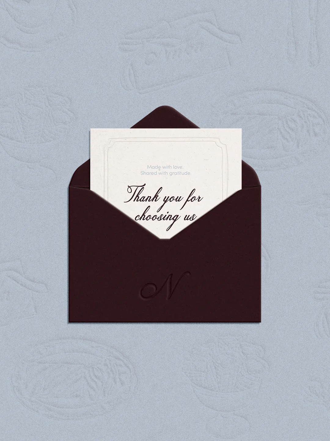
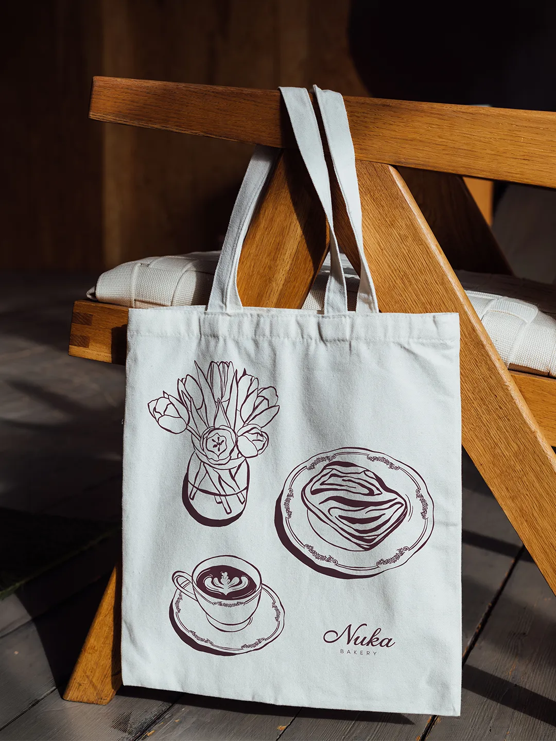
To craft a warm, whimsical, and strategically grounded brand identity that captures Nuka Bakery’s essence: a family story, an uncompromising commitment to quality, and the genuine love of making something truly delicious from scratch. The goal was to build a visual world that feels personal and distinctive, reflecting a brand that is as serious about craft as it is full of charm.
The new identity needed to:
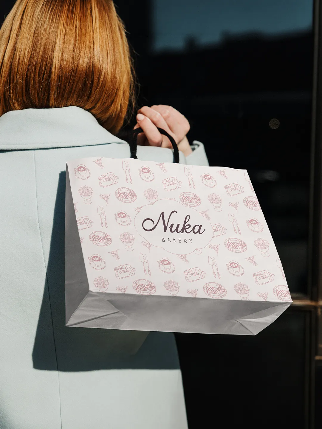
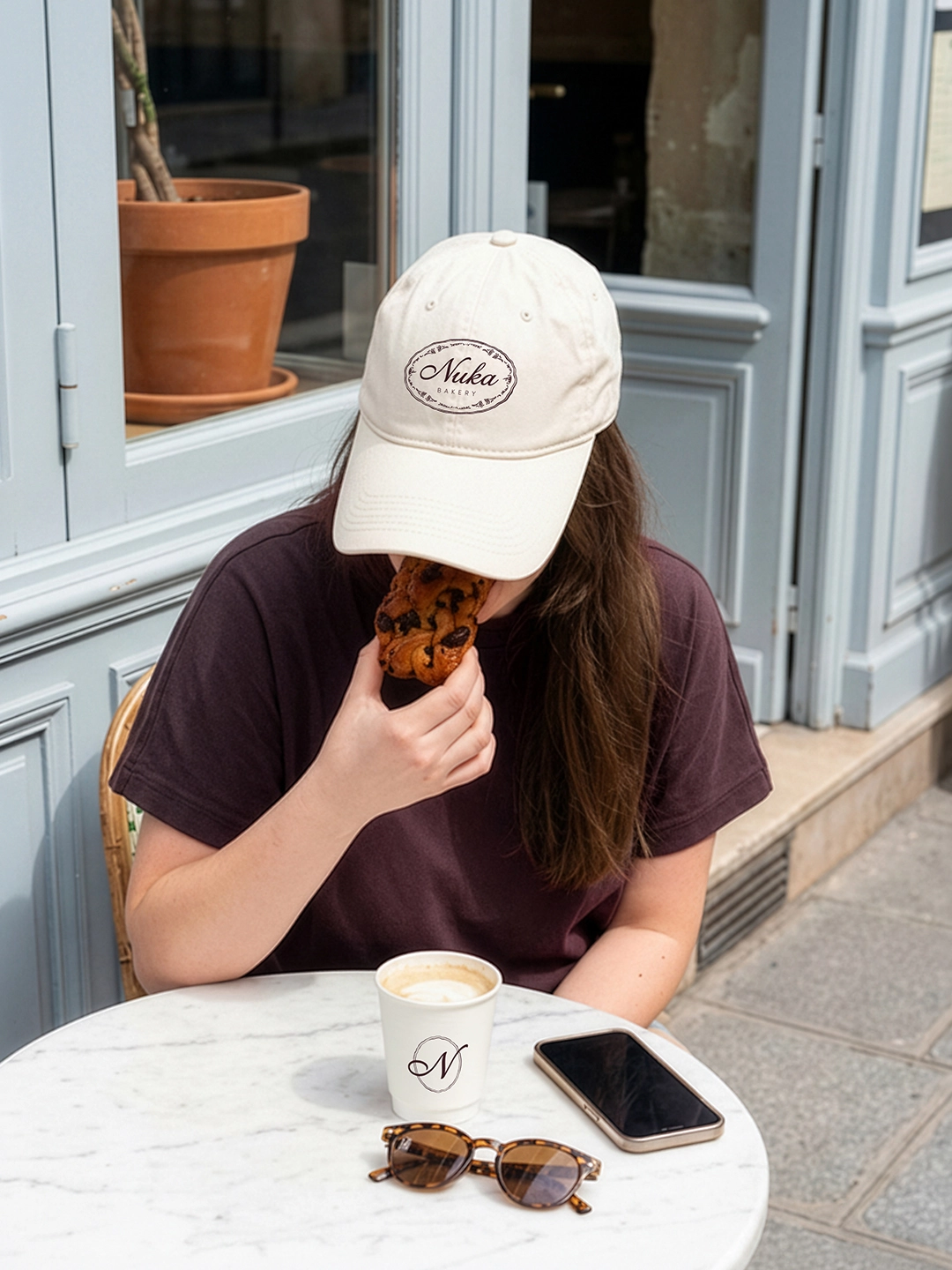
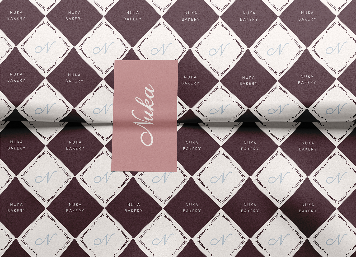
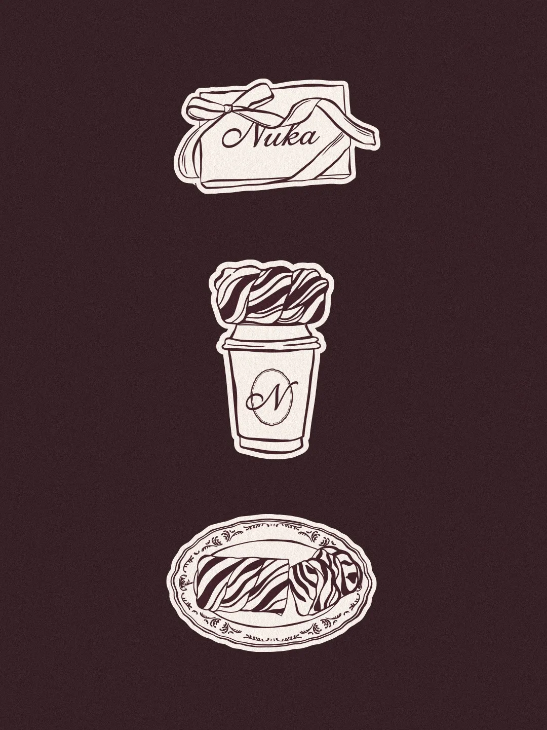
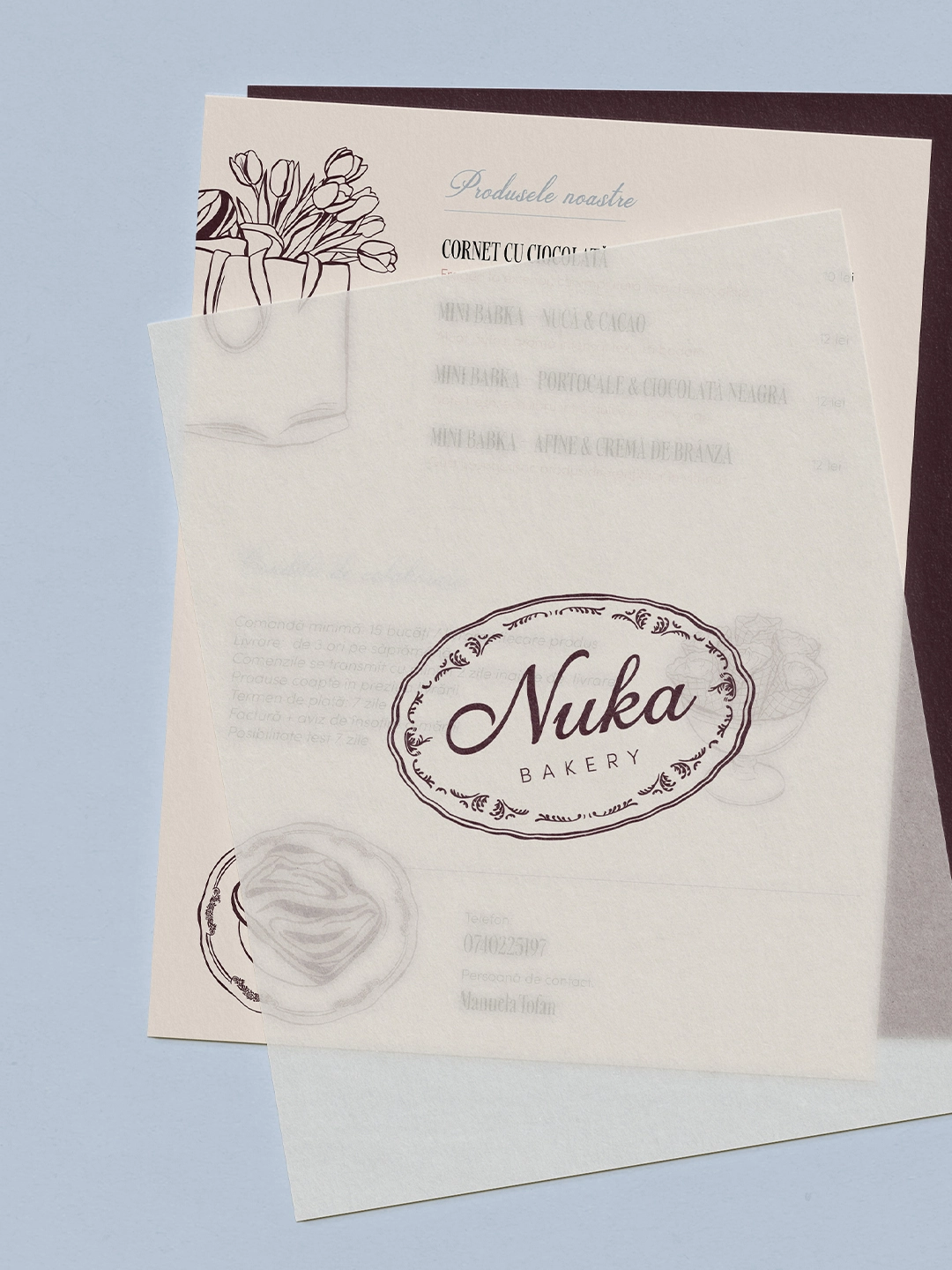
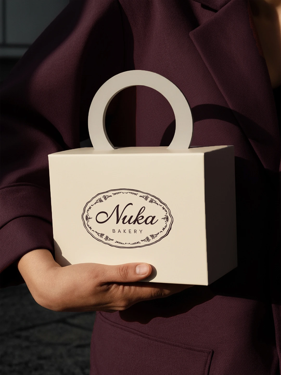
• Convey the homemade, artisanal quality of the products without feeling amateur or generic, striking the balance between warmth and professionalism that a wholesale-ready bakery brand requires. • Establish a cohesive visual language across packaging, social media, and printed materials that carries the family origin story into every touchpoint. • Differentiate the brand clearly within a local market dominated by conventional bakery aesthetics, through a distinctive color palette, a vintage ink illustration system, and a script wordmark with real personality. • Create a brand world flexible enough to grow with the business, from its current laboratory and cafe collaborations toward the long-term vision of a Nuka cafe of its own.